Table of Contents
Use AI to summarize this article
What Is User Interface (UI) Design?
User Interface (UI) design is about the screens and interactive elements that users directly engage with. This includes components like buttons, icons, menus, sliders, form fields, and the overall layout and typography of pages. For example, UI designers carefully choose colors and fonts for consistency, accessibility, and brand alignment. They organize page layout (headers, spacing, navigation bars) so it feels intuitive. They style interactive elements, buttons, dropdowns, and toggles that make user flows clear and predictable. In practice, a strong UI means the design is visually clear and attractive, so users immediately understand how to proceed. Well-designed UI elements (color contrast, legible text, obvious buttons) reduce confusion and make the site feel polished.
Key aspects of a good UI include colors (primary, secondary, and accent), typography (font families, sizes, and weights), button and icon styles, spacing/grid rules, and other branding elements (logo usage and imagery). These are usually documented in a style guide or design system (more on that below) to ensure every page follows the same visual rules. Consistency in UI builds user confidence, when the next page “looks and works” like the previous, users learn the interface faster and trust it.
What Is User Experience (UX) Design?
User Experience (UX) design focuses on the feel of a product—the entire user journey and satisfaction with it. It answers questions like "Is this website easy to navigate?" Does it solve the user’s problem? Is it enjoyable and free of frustration? UX includes everything from the first click to the last action, plus factors like ease of navigation, clarity of content, loading speed, emotional impact, and trustworthiness. For instance, IBM defines UX as the overall experience a user has, “including ease of use, accessibility, visual design, and the emotional impact of using the product."
Good UX design goes beyond aesthetics—it is user-centered. UX designers conduct research (user interviews, personas) to understand user needs and pain points, and then structure content and features to address them. The goal is to reduce “friction”—anything that hinders a user’s task—and to deliver a journey that feels intuitive and even pleasurable. For example, simplifying a checkout process or making search easy can greatly improve UX. As Don Norman (the father of UX) notes, “No product is an island… It is a cohesive, integrated set of experiences from first use through support. In practice, a positive UX boosts user satisfaction and loyalty: studies show a well-designed user experience significantly improves customer satisfaction, retention, and business outcomes.
Note: This information has been curated by industry experts in consulting, with some data referenced from the Figma Resource Library.
Key Differences Between UI and UX
Although UI and UX overlap, the distinction is this: UI is about the interface elements; UX is about the overall journey. Figma’s resource clarifies, "UI refers to the interactivity, look, and feel of a product screen or web page, while UX covers a user’s overall experience with the product or website." In other words, UI is a subset of UX. A UX designer cares about the entire experience – from market research to prototyping – whereas a UI designer specializes in building the interface visuals and interactions that users see. As IBM notes, “A UX designer focuses on the whole user interaction… whereas a UI designer… focuses on the look or style of a website."
Some practical implications: UI design involves choices like color scheme and button placement, while UX design considers information architecture, user flows, and emotional satisfaction. For example, a UI designer might pick a font and color for a button (as Figma says: “UI designers carefully choose the colors and fonts… for consistency, accessibility, and brand alignment”), whereas a UX designer tests whether that button’s label and position help users complete their goals. Put simply: a great UI can make a site look and work better; a great UX makes it feel good to use.
Why UI/UX Matters: Business and Brand Impact
Investing in UI and UX design is not just aesthetic—it directly affects your business results. A clear, intuitive UI helps users navigate effortlessly, while strong UX features (fast loading, easy checkout, helpful feedback) keep them satisfied. IBM highlights that “a well-designed user experience can significantly improve user satisfaction, retention, and even business outcomes by fostering trust and engagement." In practice, sites with excellent UX see higher conversion rates: simplified navigation, clear calls-to-action, and quick performance “can make a significant difference in whether a potential customer completes a purchase or abandons their cart." Likewise, a positive experience boosts loyalty – users are more likely to return and recommend brands that prioritize ease of use and personalization.
UX also underpins brand reputation. A seamless UX conveys professionalism: as IBM notes, consumers “associate a clear and accessible interface with trustworthiness." In fact, consistent UI and branding across all touchpoints (website, apps, packaging, marketing) build recognition and credibility. For example, a well-documented brand style guide ensures your logo, colors, and typography are used consistently, on web pages, mobile apps, social media, and even offline assets like stationery. This uniformity “builds trust and memorability” as users see the same visual language everywhere. In short, strong UI/UX not only delights users but also strengthens your brand and drives revenue.
This content is being written.
Style Guides & Design Systems: Ensuring Consistency
How do teams maintain consistent UI across products? By using a style guide or design system. A style guide (sometimes called a UI kit) is documentation of the visual rules—the palette, fonts, and component styles—that govern your product. Nielsen Norman Group explains that design systems often “contain one or more style guides… for brand, content, and visual design." For example, a typical style guide will define: - Colors: primary, secondary, and accent hues (with hex codes) for buttons, links, backgrounds, etc.
- Typography: font families, sizes, and weights for headings, body text, and captions.
- Buttons & Icons: shape, corner radius, hover states, and usage of icons.
- Spacing & Grid: margins, gutters, and responsive breakpoints to align layouts.
- Branding Elements: logo usage rules (colors, sizing, placement) and approved imagery style.
By following these guides, every screen—from homepage to mobile view—feels part of the same family. This reduces user confusion: as NN/g notes, consistency prevents unnecessary cognitive load because users “should not have to wonder whether different words, situations, or actions mean the same thing." A unified design system also speeds development (by enabling teams to reuse components) and maintains brand recognition across channels.
Usability Heuristics & Accessibility
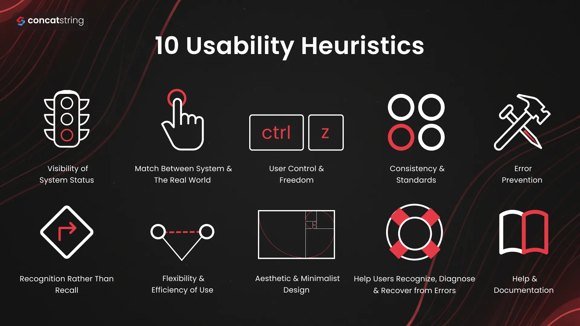
1. Visibility of System Status
The system should always keep users informed about what’s happening through timely feedback.
- Show loading indicators, progress bars, or success messages
- Confirm user actions (e.g., “Order placed successfully”)
- Avoid leaving users guessing about system responses
2. Match Between the System & the Real World
The interface should speak the user’s language and follow real-world conventions.
- Use familiar words instead of technical jargon
- Structure information in a natural and logical way
- Align UI elements with real-world expectations
3. User Control & Freedom
Users should feel in control and be able to easily undo or exit actions.
- Provide "Undo," "Redo," and “Cancel” options
- Avoid forcing users into irreversible actions
- Allow easy navigation (back, close, exit flows)
4. Consistency & Standards
Maintain consistency across the interface and follow industry standards.
- Use uniform colors, typography, and UI patterns.
- Follow platform conventions (e.g., buttons, icons)
- Ensure similar actions behave consistently
5. Error Prevention
Design the system to prevent errors before they happen.
- Use input validation and constraints
- Minimize unnecessary form fields
- Provide suggestions and auto-fill where possible
6. Recognition Rather than Recall
Reduce the need for users to remember information.
- Keep options, actions, and instructions visible
- Use dropdowns, icons, and visual cues
- Show recently used or suggested items
7. Flexibility & Efficiency of Use
Support both beginners and advanced users with efficient interactions.
- Provide shortcuts (keyboard, gestures)
- Allow personalization or customization
- Speed up frequent actions with smart defaults
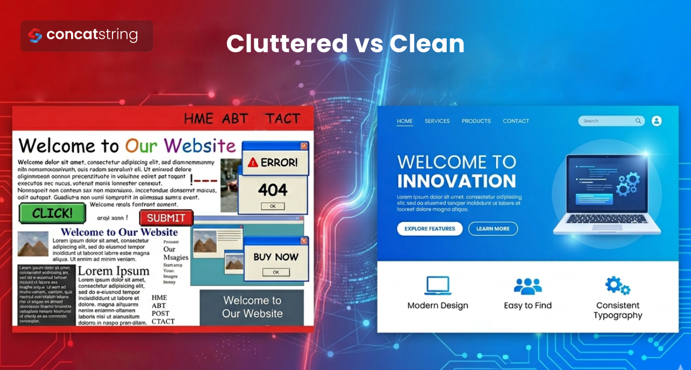
8. Aesthetic & Minimalist Design
Keep the design clean and focused on essential elements.
- Avoid clutter and unnecessary information
- Highlight important actions clearly
- Use whitespace to improve readability.
9. Help Users Recognize, Diagnose & Recover from Errors
Error messages should guide users toward solutions.
- Clearly explain what went wrong
- Suggest actionable fixes
- Avoid vague or technical error messages.
10. Help & Documentation
Provide support when users need it without overwhelming them.
- Include tooltips, FAQs, and guides
- Offer contextual help within the interface
- Make documentation easy to search and access
Tools for UI/UX Design and Analysis
Designers and developers use specialized tools to create, test, and collaborate on UI/UX. For design and prototyping, popular tools include Figma, Adobe XD, and Sketch, which let teams build and share interactive wireframes and high-fidelity mockups. (Figma, for instance, is widely used for its real-time collaboration and design systems support.) InVision and Canva are also common for quick mockups or marketing visuals.
On the analytics side, tools like Google Analytics and Mixpanel track user behavior (page views, navigation paths, funnel drop-offs) to identify friction points. Google Lighthouse (built into Chrome DevTools) and Web Vitals audits provide scores for performance, accessibility, and SEO, concrete metrics that correlate with UX. Google's Core Web Vitals, e.g., page loading speed and visual stability, are a prime example of UX benchmarks. Usability testing platforms like UserTesting or Hotjar allow you to collect direct feedback from real users. Altogether, these tools help measure the UX in data-driven ways.
Measuring UX: Metrics and Analytics
To improve UX, you must measure it. Key metrics include both qualitative feedback and quantitative data. For example:
- Usability Metrics: Task success rate (percentage of users who complete a goal) and time on task gauge efficiency. High success and low completion times indicate a smooth UI flow.
- User Satisfaction: Surveys such as Net Promoter Score (NPS) or Customer Satisfaction (CSAT) give insight into how users feel. These capture overall happiness and loyalty.
- Engagement Metrics: Number of sessions, session duration, and return frequency show how “sticky” the product is. If users keep coming back and spending time, the experience is likely compelling.
- Conversion Rates: Track how many visitors take a desired action (sign-ups, purchases). A higher conversion rate usually reflects fewer UX barriers. A/B testing tweaks (like changing button text or layout) can quantify UX impact on conversions.
- Retention/Churn: Retention rate (how many users return) versus churn rate (how many drop off) indicates long-term UX success. Retaining users is often cheaper than acquiring new ones, so high retention suggests user satisfaction.
- Error Rates: Monitor how often users encounter errors (form errors, 404 pages, etc.) and their severity. Reducing errors directly improves UX.
- Performance Scores: Technical metrics like page load time, interactivity delay, and layout shift (Core Web Vitals) affect perceived UX. Faster, smoother pages lead to happier users.
By establishing UX goals (for instance, “reduce checkout time by 20%” or “improve NPS from 30 to 40”), you can track these metrics over time. Continuous measurement lets you iterate: run user tests, collect feedback, tweak the design, and see the data change. This data-driven approach ensures any UI/UX changes truly increase user experience, instead of relying on guesswork.
Steps to Enhance Your Website’s UX
How can you put this knowledge into practice? Here are actionable steps to improve your site’s UX:
- Audit Your Current UI/UX: Use heuristics and user testing to identify pain points. Check consistency, clarity, and accessibility.
- Build a Style Guide: Document your brand’s colors, fonts, components, and layout rules. This ensures all pages follow the same design language, which boosts usability and brand trust.
- Optimize Key Flows: Simplify important user tasks (e.g., signup, checkout, search). Reduce unnecessary steps, use clear call-to-action buttons, and provide feedback (loading indicators, confirmations). As IBM notes, features like “simplified navigation, clear calls to action, and fast loading” can significantly improve conversions.
- Ensure Accessibility: Apply POUR principles. Add alt text to images, ensure keyboard navigation, choose readable fonts, and support both light/dark modes. This widens your audience and often improves overall UX.
- Test and Iterate: Use analytics (Lighthouse, Web Vitals) and direct user feedback (surveys, usability tests) to find issues. For example, if many users abandon at checkout, there may be a confusing form. Fix the problem (shorten the form, clarify fields) and measure the change.
- Monitor and Refine: UX is not one-time. Continuously track metrics (usability, satisfaction, engagement) and keep the design updated with evolving standards and user expectations. Even top products release ongoing UX refinements (see how apps get updated after user feedback).
By following these best practices—aligning UI design with UX goals, leveraging a design system for consistency, and measuring the results—you can systematically enhance the UX of your website. The outcome: users find your site easier and more enjoyable to use, and your business reaps the rewards.
Trust ConcatString for Expert UX Guidance
Understanding the difference between UI and UX and knowing how to optimize both is crucial for any business. As highlighted, a great user experience (UX) can significantly improve customer satisfaction and conversions. If you’re looking to elevate your brand’s digital presence, our team at Concatstring is here to help. We offer a free UX consultancy where our experts will audit your site, identify UI/UX improvements, and advise on actionable strategies to boost user experience. Contact ConcatString today to learn how we can transform your website into a product people love to use. Together, we’ll make every click count.
FAQs